dotdigital
LEADING THE WAY IN MARKETING AUTOMATION.
> BRAND STRATEGY
> VISUAL IDENTITY
> PACKAGING DESIGN
> DESIGN SUPPORT
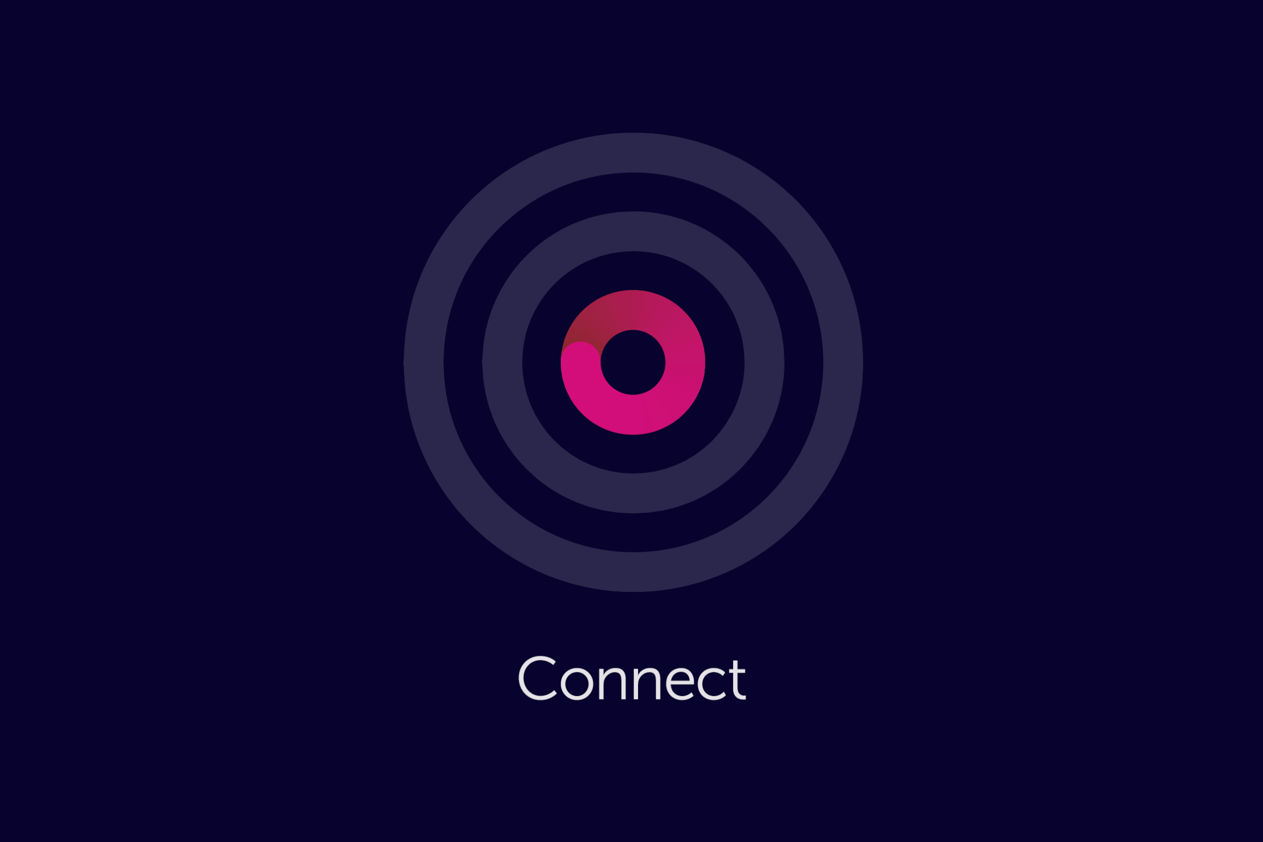
After 20 years of growth as dotmailer, it was recognised that their brand identity no longer reflected the intelligent nature of their platform. Not just an ESP anymore, but a complete digital marketing platform that empowers marketers to engage their customers like never before with a range of powerful features. As part of the marketing department's rebrand team, our main challenge was to both redefine the business identity and capture a sense of evolution without diluting the original dotmailer brand equity.

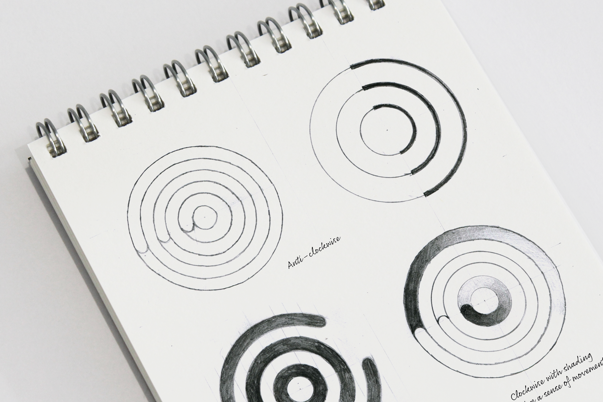


Original logotype
We quickly exposed the limitations of the old brand name. dotmailer as a brand name is predominantly email-focused and now misleading, so the decision was made to change their name to dotdigital, to capture the full-service nature of the business and the software platform.


Dotdigital’s new brand identity has helped to achieve some amazing results:
32%
Upift in website visits
24x
ROI in first year
42%
Increase in revenue

“spencer just gets it”
“Put simply, Spencer is the best designer/creative director/branding expert I’ve met or worked with. With a background in design, I’m not easily pleased, but Spencer just gets it when briefed, then delights when delivering the creative. And if you needed extra convincing, he’s a super nice guy to boot.”
Phil Draper, CMO, Dotdigital
VIEW MORE
-
![Stacks of business cards with the messages 'We Inspire Change' in blue and 'We Listen Carefully' in red and white on a dark background.]()
Positive Support group
600% revenue growth in 6 years of partnership
-
![A young woman with short, curly brown hair and fair skin, wearing a gray satin top with lace detail, holding a small box labeled 'celf' in front of a yellow background.]()
Celf Beauty
20,000 new customers in first year
-
![Three colorful cards with cartoon superhero theme. The left card has a penguin face and says, 'We think you're a real hoot.' The middle card has a pink frosted donut with sprinkles and says, 'Donut stop being awesome.' The right card has a black Batman face and says, 'Become a subject line superhero.']()
Phrasee
Humanising AI with an unconventional identity
-
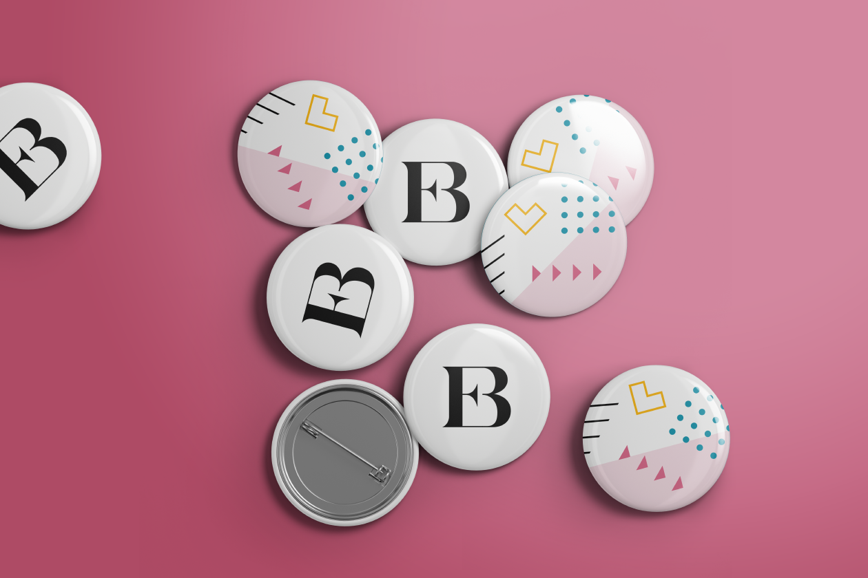
![A group of metal badges on pink background with 'EB' monogram and pattern design]()
Email Boutique
200% revenue lift and 50% increase in bookings
-
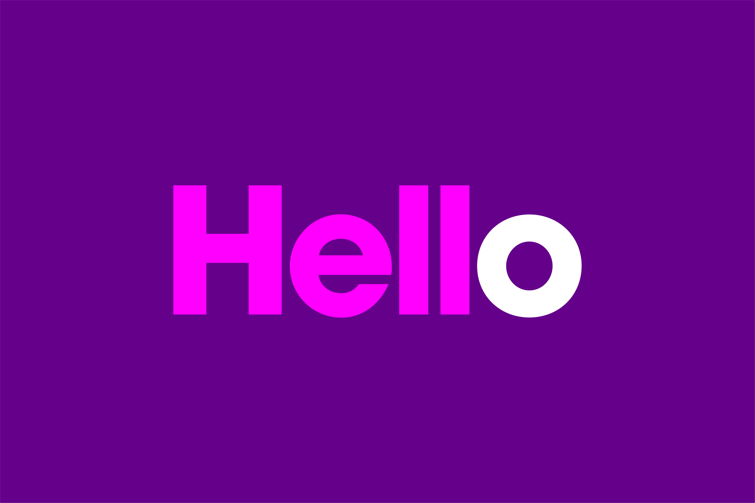
![The word 'Hello' in pink with white 'o' on purple background]()
Pure360
Reinvigorating a beloved Brighton MarTech