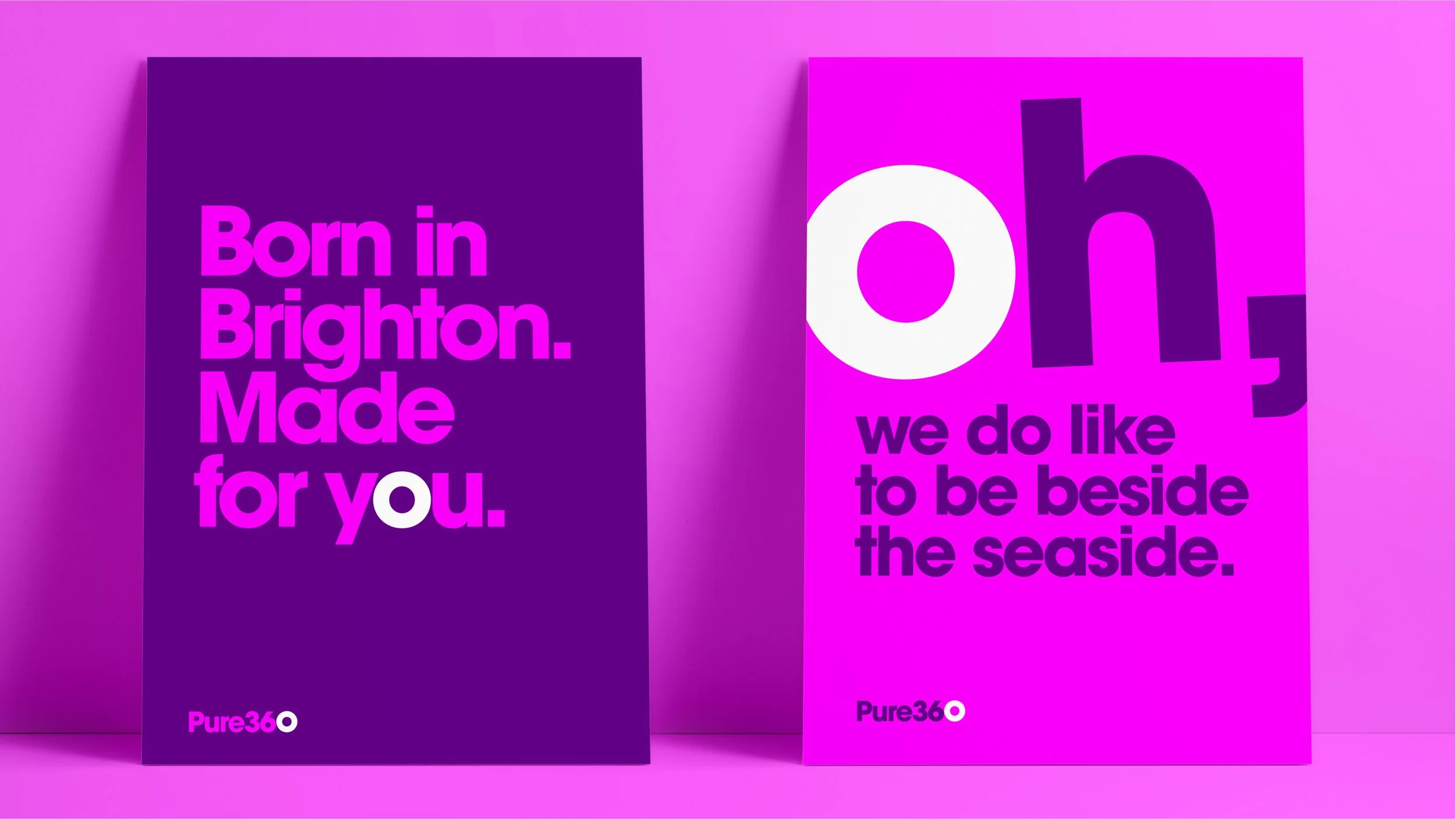
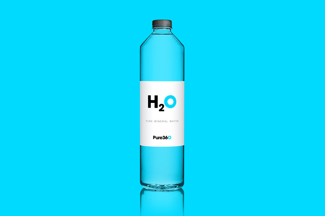
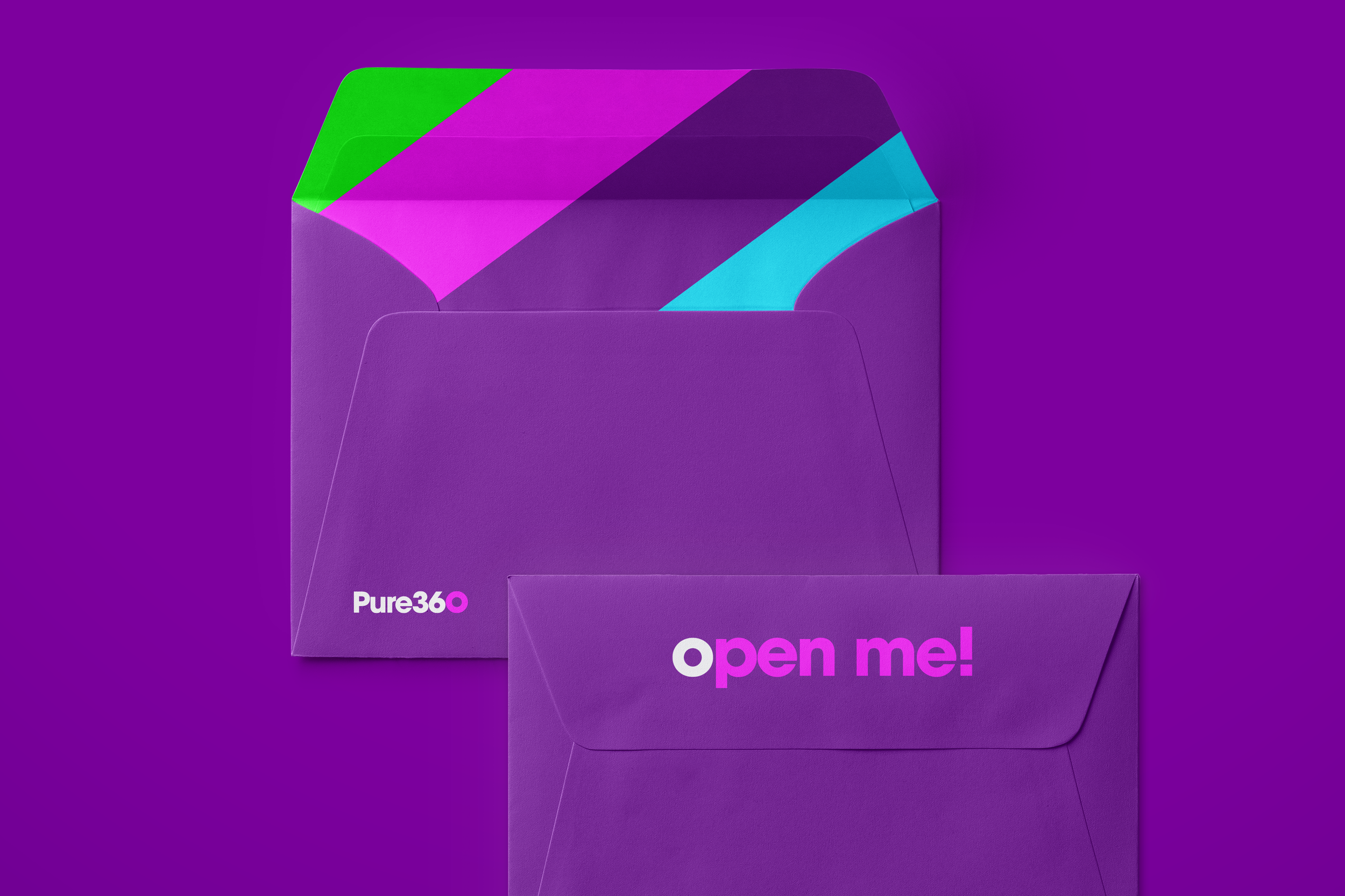
Pure360
REINVIGORATING A BRIGHTON MARTECH.
> BRAND STRATEGY
> VISUAL IDENTITY
> VIDEO DIRECTION
> DESIGN SUPPORT
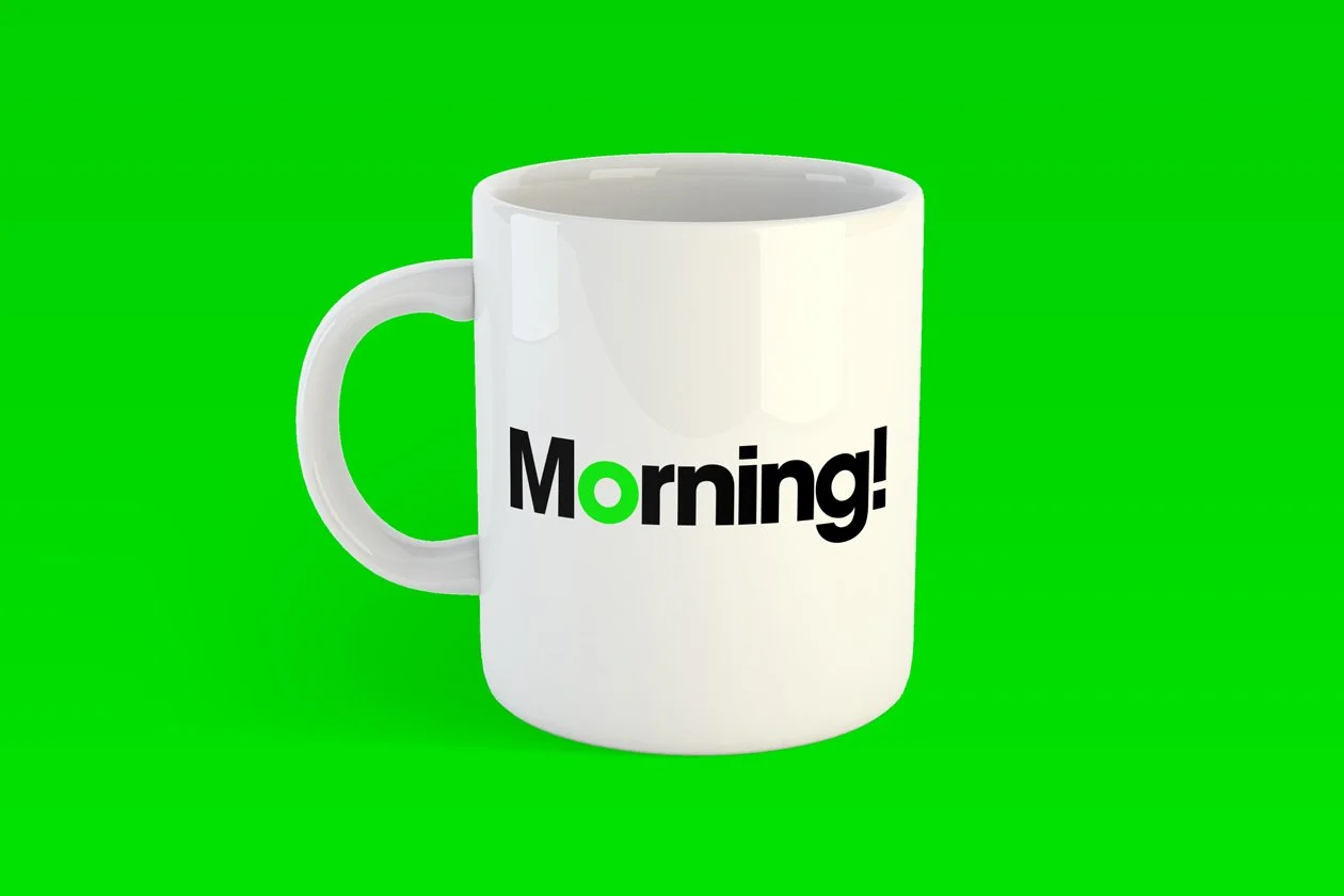
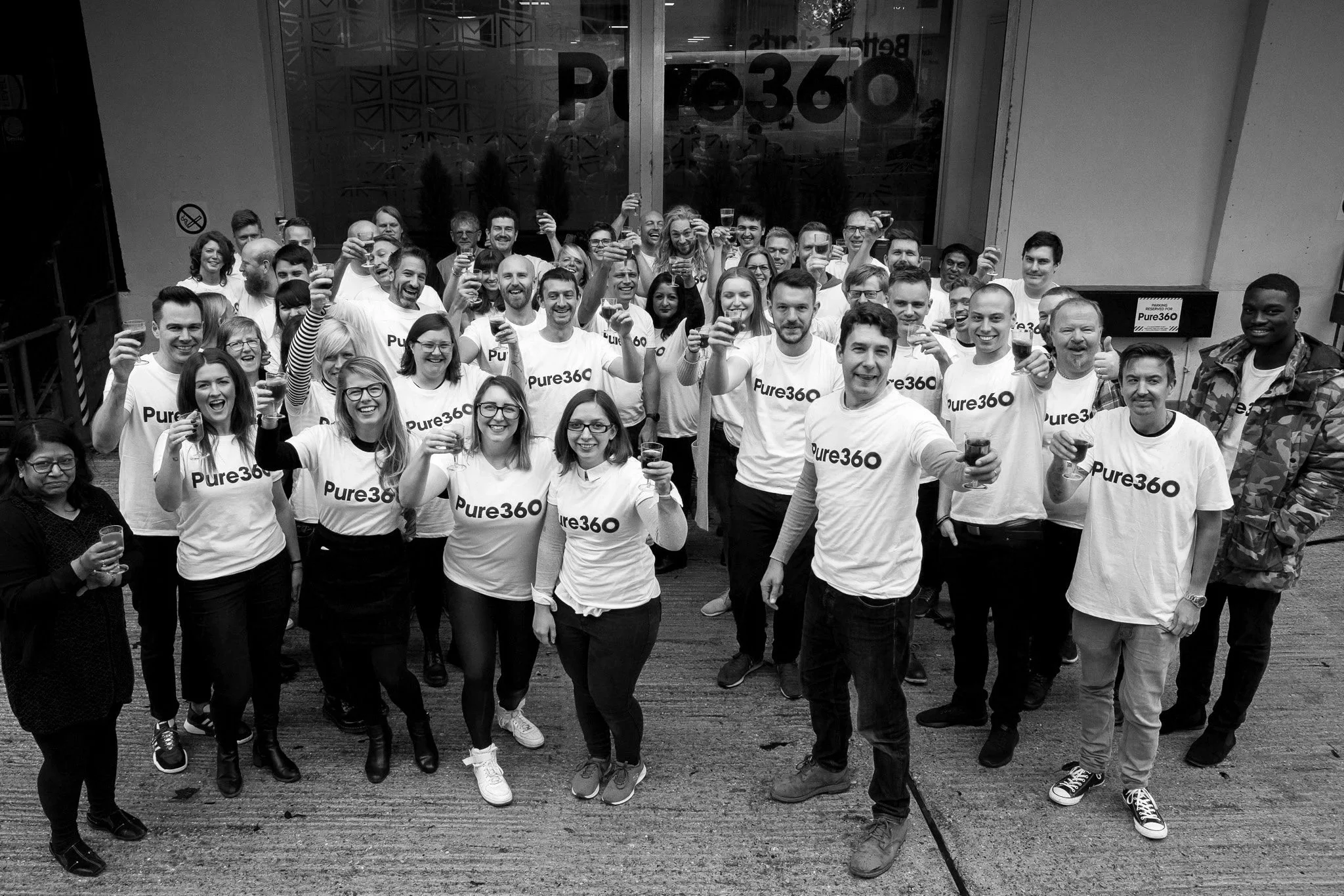
To coincide with the launch of their new all-in-one marketing platform, I was asked to create a new brand identity for Pure360 to both redefine their business offering and reinvigorate their employees and customer base. Drawing inspiration from their home town of Brighton, we devised an identity that was bright, fun, engaging and a little bit different. Using bold typography alongside playful messaging and a vibrant colour palette, Pure360 has reimagined itself as a fresh, spirited and forward-thinking organisation where great customer service and great results are king.


“Well, what can I say but wow!”
As soon as we began talking, I knew Spencer immediately grasped the project vision and fully understood what I wanted to achieve at Pure360. Not only was his methodology on point, but the creative flair blew our minds from the very first concept. A simple but tremendous impact that was exactly on brief. Although we were delivering against tight deadlines, working with Spencer was seamless, and all time frames were met. The final brand identity has had hundreds of 5* positive reviews, and for that, we couldn't be happier. Spencer is the best creative partner I have ever worked with, and I would recommend him to everyone!"
Komal Helyer, VP of Marketing, Pure360
VIEW MORE
-
![Colorful concentric circles with a dark background, resembling a digital target or activity rings.]()
Dotdigital
Taking the lead in marketing automation
-
![A young woman with short, curly brown hair and fair skin, wearing a gray satin top with lace detail, holding a small box labeled 'celf' in front of a yellow background.]()
Celf Beauty
20,000 new customers in first year
-
![Three colorful cards with cartoon superhero theme. The left card has a penguin face and says, 'We think you're a real hoot.' The middle card has a pink frosted donut with sprinkles and says, 'Donut stop being awesome.' The right card has a black Batman face and says, 'Become a subject line superhero.']()
Phrasee
Humanising AI with an unconventional identity
-
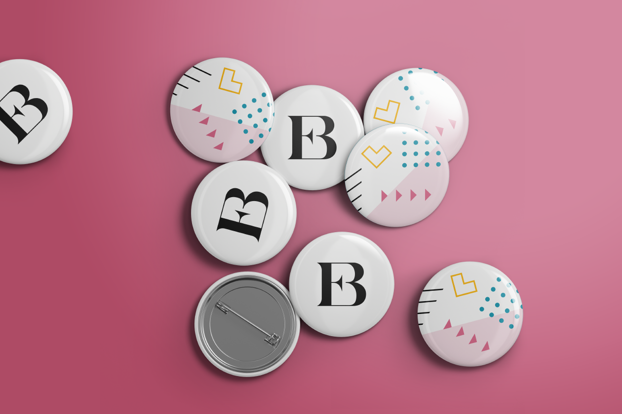
![A group of metal badges on pink background with 'EB' monogram and pattern design]()
Email Boutique
200% revenue lift and 50% increase in bookings
-
![Stacks of business cards with the messages 'We Inspire Change' in blue and 'We Listen Carefully' in red and white on a dark background.]()
Positive Support Group
600% revenue growth in 6 years of partnership